tutorial adsense languages indonesia
Click hare to download
Read More.
Here we will tell you how to make a Photoshop-tutorial-make-rain-cloud-lighthouse in photoshop.
[1] You may use any photos you want.
{2] Create a new layer on top, fill it with Black
[3] Go to Filter>Noise>Add Noise use these values.
[4] Your picture something like this.
[5] Go to Filter>Blur>Motion Blur use these settings now change the Blending Mode to Overlay.
[6] Your picture should be look like this.
[7] Now select this layer.
[8] Then press Cntl+U, to Hue/Saturation use these values.
[9] Your picture something look like this.
[10] Press CTRL+L and add these settings
[11] I hope you are enjoy this photoshop tutorials so far. See below how you image will look like.
137 free online photoshop tutorial
135 photoshop effects tutorial
taken from the blog: http://oogletutorials.com/


BRUSNES For Photoshop CS2, CS3 and CS4 IF Tasting DOWNLOAD PLEASE CLICK HERE
You EXtra AFTER DOWNLOAD rar KOPY THEN PASTE TO FOLDER BRUSS PhotoShop
Enjoy and try
CHEK HARE TO DOWNLOAD 30_Drippy_Sprays Brunes![]()
Read More.
This tutorial shows how to create a scorched parchment texture, for a website design or a wedding invitation card.
If you plan on printing this design out, I'd recommend making it about 3000 pixels wide, by 4500 tall. Use Ctrl- to zoom out
![]() Create a new layer.
Create a new layer.
![]() Choose the Selection Tool, and select a rectangle in the centre of the area.
Choose the Selection Tool, and select a rectangle in the centre of the area.
![]() Fill the area with a tan colour. I've used #E8E0BE here. Press Ctrl+D to deselect the area.
Fill the area with a tan colour. I've used #E8E0BE here. Press Ctrl+D to deselect the area.
![]() Create a new layer.
Create a new layer.
![]() Fill it with 50% grey.
Fill it with 50% grey.
Click Filter > Noise > Add Noise. Set it to 10%, Gaussian, Monochromatic, and press OK.
Change this layer's Mode from Normal to Overlay.
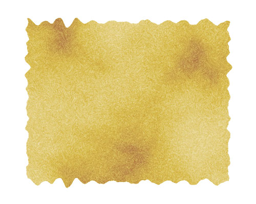
2 – Scorching the parchment
![]() Create a new layer.
Create a new layer.
Set the colours back to black and white, by pressing "d", and Click Filter > Render > Clouds.
Change the layer's Mode from Normal to Color Burn, and set its Opacity to 50%.
The next step is to distort the edges of the paper, to give it a jagged appearance.
In the Layers list, click on your tan-coloured, paper layer. It should be called "Layer 1".
Click Filter > Distort > Wave, to bring up the Wave window. There's a lot of guesswork involved here. You may need to try this a few times, until you get a Wave effect you like.
Set the number of Generators to around 100. This creates a hundred sources of ripples, which creates a very random effect over all. (Having less Generators produces more regular waves, which isn't what we want here. Think of the number of Generators as being the number of pebbles you're throwing into a pond.)
Set the Wavelength, Amplitude, and Scale sliders to low numbers (around 10), and press OK.
This wave will now be saved, so you can click on Layer 2 and Layer 3, and Click Filter > Wave (or Ctrl+F) to repeat the same wave on each layer.
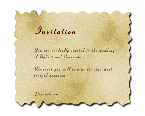
At this point, change the colour of Layer 1 by pressing Ctrl+U, to adjust its Hue/Saturation properties. I do this for almost everything I create in Photoshop.
![]() Add in your own text. I've used the Pageant font here.
Add in your own text. I've used the Pageant font here.
For added effect, add a space between each letter, or increase the Tracking. (It's the "A V" on the Character Palette, which can be accessed by clicking Window > Character.)
Right-click "Layer 1" and choose Blending Options (Effects in Photoshop 5.5.) Give the layer a normal Drop Shadow, and press Ok.
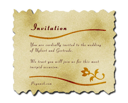
![]() Create a new layer.
Create a new layer.
![]() To create the swirly dividers, choose the Selection Tool, and select a narrow strip.
To create the swirly dividers, choose the Selection Tool, and select a narrow strip.
![]() Fill the selected area with a dark brown. I've used #724C40 here.
Fill the selected area with a dark brown. I've used #724C40 here.
Press Ctrl+D to deselect.
Click Filter > Twirl, and press OK.
Change the layer to Color Burn.
Right-click this layer, and Duplicate it.
To flip the duplicate layer, click Edit > Transform > Flip Horizontal.
![]() If you're using Photoshop 6.0, 7.0, or CS, choose the Shape Tool to put in an extra doodad (a flower in this case.) Once you've clicked the Shape Tool, make sure the "Fill Pixels" square, at the top left of the screen, is selected. Then, click the drop-down box next to "Shape:". Click the sideways arrow, Choose "All", and press OK. Then select the Flower from the list. Hold Shift and apply it to your image.
If you're using Photoshop 6.0, 7.0, or CS, choose the Shape Tool to put in an extra doodad (a flower in this case.) Once you've clicked the Shape Tool, make sure the "Fill Pixels" square, at the top left of the screen, is selected. Then, click the drop-down box next to "Shape:". Click the sideways arrow, Choose "All", and press OK. Then select the Flower from the list. Hold Shift and apply it to your image.
Your own printable wedding invitation is now complete.
Read More.Having your company logo design done by a professional can be an expensive process. Hopefully this tutorial will give you some ideas on creating your company logo yourself.
If you plan to have your company logo printed on paper at any stage, I would strongly advise making it high resolution (300 dots per inch or more), otherwise your image will look pixellated when you print it. You can always create a smaller, lower-quality version of your company logo design for the web.

![]() Start by using the Text Tool and typing the main word of your company name. Select a darkish or midtone colour, and choose a serif (curly-edged) font such as Palatino Linotype or Times New Roman. Use all capitals, and slightly enlarge the first letter.
Start by using the Text Tool and typing the main word of your company name. Select a darkish or midtone colour, and choose a serif (curly-edged) font such as Palatino Linotype or Times New Roman. Use all capitals, and slightly enlarge the first letter.

![]() Using the same font, put the rest of your company name, or some other descriptive phrase, underneath the main header. Use a much smaller font size, and increase the letter spacing by typing a high number into the "Tracking" box. (Alternatively, you can just put a space between each letter.)
Using the same font, put the rest of your company name, or some other descriptive phrase, underneath the main header. Use a much smaller font size, and increase the letter spacing by typing a high number into the "Tracking" box. (Alternatively, you can just put a space between each letter.)
The horizontal lines I've put in help to separate out and highlight the text of the company logo. An easy way to make a line is to use the text tool and type an underscore ( _ ), then press Ctrl+T to transform it into an elongated shape.

With just words and lines, your logo design will look dull.
![]() If you don't already have a small image you'd like to use, you can use the Shape Tool in Adobe Photoshop 6.0 and 7 to draw a shape.
If you don't already have a small image you'd like to use, you can use the Shape Tool in Adobe Photoshop 6.0 and 7 to draw a shape.
![]() Another option is to use the Text Tool, and type a character in the Wingdings font.
Another option is to use the Text Tool, and type a character in the Wingdings font.
At this point, your company logo design is finished, and will look good both on screen and on paper. However, if you want to embellish it further for the screen, then read on. Embellishing your company logo design will make it look nicer, but it won't be as clear.

A black border like this will help accentuate the colours in your logo design. With your background colour set to black, click Image > Canvas Size, and increase the height of the image a bit. The extra space on your logo design will be filled with the background colour (black).

![]() Choose a very light grey colour, select the Text Tool, and write "jk" in Wingdings font. Make the font size very large. "j" and "k" in Wingdings show up as nice swirly characters, which make a nice watermark. In the Layers window, drag this layer almost to the bottom of the list, so it doesn't cover up any other layers.
Choose a very light grey colour, select the Text Tool, and write "jk" in Wingdings font. Make the font size very large. "j" and "k" in Wingdings show up as nice swirly characters, which make a nice watermark. In the Layers window, drag this layer almost to the bottom of the list, so it doesn't cover up any other layers.

To add some effects, right-click on a layer, then click "Effects" (Adobe Photoshop 5) or "Blending Options" (Adobe Photoshop 7.0 and 6). I added the following effects to some of the layers: Bevel and Emboss (set to Inner Bevel), Drop Shadow, Gradient Overlay (set to Overlay mode.)
I also changed the Comco header's text colour to blue, and made the horizontal lines orange. Feel free to change any of the colours on your company logo to whatever suits your purpose.
If you can't manage to do it yourself, you can get professional logo design done fairly cheaply at LogoWorks. Have a look at their site if you're interested.
It's easy to make a coloured block of text, or a simple diagram (e.g. a flag), but to make it look like it's actually real, you'll need to follow these steps:
1 – Setting UpTake your object (Australian flag in this case), and make some space around it, by clicking Image > Canvas Size, and putting in a greater height and width for the canvas.
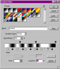
Now make a new image, the same size as your first image.
![]() Select the "Gradient" tool, and edit the gradient (Click on the visual representation of the gradient, or click on "Edit" on the Options tab.) Put in lots of black and white markers, as I've done in the image (this will make your gradient produce black and white bars).
Select the "Gradient" tool, and edit the gradient (Click on the visual representation of the gradient, or click on "Edit" on the Options tab.) Put in lots of black and white markers, as I've done in the image (this will make your gradient produce black and white bars).
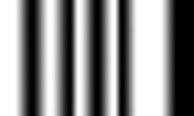
![]() Hold down Shift, and apply the gradient across your new image from left to right.
Hold down Shift, and apply the gradient across your new image from left to right.
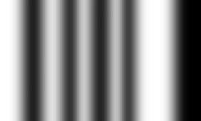
Click Filter > Blur > Gaussian Blur, and blur your image a bit. This image is now your "displacement map". Save this image (I generally use the name "dispmap.psd").

Now go back to your original flag image, and click Filter > Distort > Displace. Put 0% in "Horizontal Scale" and 5% in "Vertical Scale". (You can go higher if you want the waves to be bigger.) When it asks for a file, select your displacement map. (This will distort your image depending on how dark the displacement map is at that point.)
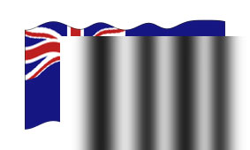
Now grab your displacement map image, and drag it onto your image. Use the arrow keys to nudge the displacement map until it covers the whole image.
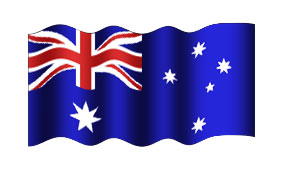
Change the displacement map layer's Mode from Normal to Overlay, and reduce its opacity (75% is good).
Voila, a funky flag. Scroll up and compare this image to the first one, and you'll really notice the difference.
This technique can also be used to make realistic curtains, ribbons, and banners.
brus tool dragonbrunes you like download clik haretutorial: ckhik hare
saifuddin aceh BANDA ACEH NANGGROE ACEH DARUSALAM aceh, male, 23000 nanggroe aceh darusalam | Work: 06517555275 Fax: 06517555275 uddin_bireun@yahoo.com | |
| Visit MyBlogLog and get a signature like this! | ||


SOFTWARE DOWNLOAD AND TUTORIAL PHOTOSHOP CORELDRAW ©Template Blogger Green by Dicas Blogger. SOFTWARE DOWNLOAD AND TUTORIAL PHOTOSHOP CORELDRAW ©Template Editing by Udin Sira.