Tuesday, August 11, 2009

winamp change your AIMP with a more classic look to its


this simple picture as I do for example uplopad image software play songs, I used to use winamp, but now I prefer to use a more simple AIMP and the computer does not make us weak and I also like the look of it is quite interesting if we tough in the image of on whether you like the view as the image display on the
if you like with this software you can download here


good job for all the success you always


<---------------------------------------------->

download AIMP

Read More.

Bookmark and Share

Sunday, August 9, 2009

Free download CCleaner Version v2.21.940


Version download CCleaner Version v2.21.940 latest free .. Or CCleaner Crap Cleaner is a tool that can be used to optimize the performance of Windows systems. This tool works by removing all temporary files that are not used so that more hard disk space and the width of the system will speed up the performance of your windows. In addition, this tool can also be used for free (free).

CCleaner work with this how to delete some files from:

*

Internet Explorer Cache, History, Cookies, Index.dat.
*

Recycle Bin, files and Log files temporari.
*

Delete all files and URLs that has just opened.
*

Third-party applications usually create a file in the temp folder and a list of files that we open, including: Firefox, Opera, Safari, Google Chrome, Media Player, emule, Kazaa, Google Toolbar, Netscape, Office, Nero, Adobe, Acrobat, WinRAR, WinAce, WinZip and others.
*

Do a search on the Registry entries and delete all entries that are not used. Including the file extension such as: ActiveX Control, CalssIDs, ProgIDs, Uninstallers, Shared DLLs, Fonts, Help Files Application Paths, Icon, Invalid Shortcuts and various other files. Before cleaning feature is also provided for membackup registry first.
*

This application can also be used to remove all the startup files that can worsen the performance of windows in which the loading process will be long.

CClener than this for free, also has the ability to work quickly to find all the files and the entry on your Windows system.

chik hare download CCleaner Version v2.21.940


Read More.

Bookmark and Share

Thursday, August 6, 2009

Avira Free Antivirus Personal Edition

Avira Free Antivirus is one of the best Antivirus software available. Considering the fact that it is totally Free, Avira is just amazing.

Avira AntiVir Personal Free Antivirus is a comprehensive, easy to use antivirus program, designed to offer reliable virus protection to home-users. It protects your computer against dangerous viruses, worms, Trojans and costly dialers. It also includes a basic Anti-Spyware. And it offers all this completely free of charge. .
Avira Free Antivirus


Some of the features that we love about this Free Antivirus:

* Very high rates of virus and malware detection using innovative search technologies (search engines) and heuristic search processes
* It runs in your system’s background, and doesn’t hogs down system’s resources.
* Scanner (On-Demand Scan) with profile-controlled and configurable search for all known types of virus and malware
* High-performance multithreading function (simultaneous high-speed scanning of multiple files)
* Integrated quarantine management to isolate and process suspicious files
* Rootkit protection for detecting hidden malware installed in your computer system (rootkits)
* Guard (On-Access Scan) for continuous monitoring of all file access attempts.
* Simple and quick updates to the program, virus definitions, and search engine through Single File Update and incremental VDF updates via a webserver on the Internet.


Download Link1: Click Here to Download

Read More.

Bookmark and Share

Sunday, August 2, 2009

Enterprise Databases: Multiply and It's Tough to Prosper

Ann All spoke with Marcus Collins, a Burton Group analyst and author of a recent report titled “Clash of the Titans: Comparing Enterprise Databases.”
All: Why is it so common for large enterprises to have multiple databases?

Collins: There are a of couple key reasons. First, there are mergers and acquisitions. With those, you end up with multiple large databases, the kind you have when you acquire multiple ERP systems, for instance. Another is what people call “shadow IT.” With that, you typically end up with multiple small databases. It’s usually a response to the perceived slowness of IT. A department might bring in SQL Server. Since the company probably has corporate licenses for Microsoft, they can do it. Departmental users have a problem to solve, and they want it to be quick and easy and to move on.

Another interesting reason is around the cost model. Who bears the cost of additional databases? IT tends to say, “Go with our defined standards.” Business will go ahead with another database because essentially there is no additional cost to them. They productize it and give it back to IT, and say, “You need to run this for us.” The IT costing model tends to be that IT runs everything, so there’s no cost disincentive to the business.


All: Your advice is to reduce the number of databases to reduce costs associated with the complexity of a heterogeneous environment. Is standardizing on a single database a realistic goal for most organizations?

Collins: The simple answer is probably no for established customers who have done mergers and acquisitions. It’s difficult to justify the cost of redevelopment to get to a single database. One of the keys here is it’s easier to develop applications than to retire them. It’s the legacy problem, which gets back again to the costing model. Redevelopment could cost many millions of dollars, where additional licenses may cost many thousands. There are no dynamics in play for organizations to say “We really need to get rid of these.”


Perhaps that isn’t the case for organizations that have grown organically. The key is to get control of your IT portfolio as it grows. You can’t say “Let’s do things fast and not worry about cost” or you will just end up with a legacy problem. It’ll come back to bite you, cost-wise. Before you go ahead and bring something else into an organization, you need to think carefully about it. I think the realistic advice is don’t get to heterogeneity simply because you didn’t think about it. But if the additional benefits (of another database) outweigh the costs, go ahead and do it. You must think about the additional costs and offset them against the business benefits. If you gain real competitive advantage by bringing in an application that’ll only run on SQL Server, then it’s a no-brainer.


The other dynamic is the business imperative. If organizations today in many cases are fighting for survival, the last thing they’re going to worry about is ending up with another database. This occurs on the departmental level as well, where people are measured on achieving business success. It raises the wider question of how organizations make strategic IT decisions. One way to is to get proof of concept in one part of an organization and then use it as a sort of poster child to the broader business. You can say, “Look at what we’ve achieved in marketing, and see what you can achieve in finance.” The idea of a top-down enterprise architecture approach is a very tough sell.


All: How specifically can organizations cut and/or control costs by standardizing on a database or at least reducing the instances of multiple ones?

Collins: Even if you have multiple databases, you can standardize your operational model, the way you do day-to-day operations, and reduce the overall cost. Database vendors are helping. They want to push that it’s cheaper to run database X than database Y, so they are focusing on automation of operation. As interesting as that is, does the business care? Probably not. But if IT becomes more responsive, that does interest the business.


The key for IT is to have standardization to reduce cost but also to become more responsive. You don’t want to invent a bureaucracy. You want to have standards so everything can run smoothly and make IT more responsive to the business. You want to be able to say to the business, “If you want to go outside (the standards), here’s what it will cost.” It’s like having a shopping list, if you will. You should be able to say, “The standard infrastructure costs X per month per gigabyte. Here’s how much it will cost if you want to do it another way.” Transparency is key.


In that respect, IT has to be able to put a cost on standardizing. Then what it has to do, of course, is add value. If you show costs of $10 a gigabyte and you can buy $8 a gigabyte down the road, then you are not showing value. So IT should structure itself so it begins first to add value. And then automate processes to the greatest extent possible to cut costs.


All: What roles should both the business and IT play in evaluating and selecting databases?

Collins: The demarcation is clear, although it’s not necessarily the way it’s done now. The business role is to come with a set of requirements. What business tends to do is say, “I need this and that, and by the way I want Microsoft Sharepoint.” Ideally, the business shouldn’t impose tools on IT. The business should focus on people and processes, not tools.


IT needs to come along, and say, “We can do it and even look at the tools you suggest, but we need to bring in security, scalability and other non-functional areas.” Then the decision should be made jointly. The right tool may fill a business imperative and not fulfill reliability and scalability. IT should be able to say, “Here’s what the additional cost of your tool preference will be.” It must be able to quantify those costs, and in some cases it can’t do that.


All: You emphasize that it’s important to get product roadmaps for databases. This is always a good idea when evaluating enterprise technology. Is it even more so when evaluating databases?

Collins: It’s very difficult to differentiate between the major databases today. They have become to some extent a commodity, in the same way operating systems have become a commodity. Vendors don’t like to hear that, they want you to think they have a technology edge. If you try to make a differentiation on technology, know that it is going to change. The vendors are in a technical arms race. So if you’re looking at a product, and you want some specific niche functionality you are interested in, be careful not to make it the one thing upon which you base your decision. The key is to bring in a number of different factors. It shouldn’t be about who has the coolest technology today. A strategic decision to go with a particular database vendor is a complex decision. You need to consider business, IT and commercial concerns.


All: You also note that it can be difficult to compare costs and performance due to the ways vendors present information. Any tips?

Collins: It is difficult to read marketing literature, look at vendor costing models, and come to a simple decision as to which is cheapest. In general, SQL Server has more smaller database implementations. If you look at the overall costs of management, it’s probably cheaper than Oracle. But that’s because smaller databases are generally easier to manage. So if you look at cost per database, that’s not a valid measure there. It comes down to being a more sophisticated decision.


What is your database organization going to do? Are you going to do lot of in-house development? If so, you’ll need to work with database vendors to tune performance. Organizations need to look at models of how they use a database. Look at the TCO, the licensing, the manpower, the costs to run it.


Because there are so many database implementations out there, you only have to go to user groups to find organizations with similar situations to yours. So seeking advice from members of user groups is a good idea.


Read More.

Bookmark and Share

Sunday, July 26, 2009

tutorial adsense languages indonesia

simpel image minimize.


I lot more busy work so not had time to post this cuman existing aja download, you can learn languages with adsense indonesia

Click hare to download


Read More.

Bookmark and Share

Thursday, July 23, 2009

Photoshop tutorial make rain cloud lighthouse

Here we will tell you how to make a Photoshop-tutorial-make-rain-cloud-lighthouse in photoshop.

[1] You may use any photos you want.

Photoshop-tutorial-make-rain-cloud-lighthouse1

{2] Create a new layer on top, fill it with Black


Photoshop-tutorial-make-rain-cloud-lighthouse2

Photoshop-tutorial-make-rain-cloud-lighthouse3

[3] Go to Filter>Noise>Add Noise use these values.

Photoshop-tutorial-make-rain-cloud-lighthouse4

[4] Your picture something like this.

Photoshop-tutorial-make-rain-cloud-lighthouse5

[5] Go to Filter>Blur>Motion Blur use these settings now change the Blending Mode to Overlay.

Photoshop-tutorial-make-rain-cloud-lighthouse6

Photoshop-tutorial-make-rain-cloud-lighthouse7

[6] Your picture should be look like this.

Photoshop-tutorial-make-rain-cloud-lighthouse8

[7] Now select this layer.

Photoshop-tutorial-make-rain-cloud-lighthouse9

[8] Then press Cntl+U, to Hue/Saturation use these values.

Photoshop-tutorial-make-rain-cloud-lighthouse10

[9] Your picture something look like this.

Photoshop-tutorial-make-rain-cloud-lighthouse11

[10] Press CTRL+L and add these settings

Photoshop-tutorial-make-rain-cloud-lighthouse12

[11] I hope you are enjoy this photoshop tutorials so far. See below how you image will look like.

Photoshop-tutorial-make-rain-cloud-lighthouse13

137 free online photoshop tutorial
135 photoshop effects tutorial

taken from the blog: http://oogletutorials.com/


Read More.

Bookmark and Share

DOWNLOAD 30_Drippy_Sprays Brunes


BRUSNES For Photoshop CS2, CS3 and CS4 IF Tasting DOWNLOAD PLEASE CLICK HERE
You EXtra AFTER DOWNLOAD rar KOPY THEN PASTE TO FOLDER BRUSS PhotoShop
Enjoy and try


CHEK HARE TO DOWNLOAD 30_Drippy_Sprays Brunes


Read More.

Bookmark and Share

Tuesday, July 21, 2009

Making a Wedding Invitation in Photoshop

This tutorial shows how to create a scorched parchment texture, for a website design or a wedding invitation card.

If you plan on printing this design out, I'd recommend making it about 3000 pixels wide, by 4500 tall. Use Ctrl- to zoom out


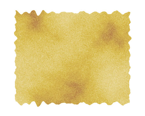
1 – Creating the initial paper colour and texture

Create a new layer.

Choose the Selection Tool, and select a rectangle in the centre of the area.

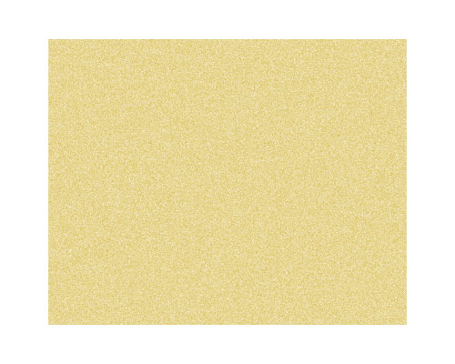
Fill the area with a tan colour. I've used #E8E0BE here. Press Ctrl+D to deselect the area.

Create a new layer.

Fill it with 50% grey.

Click Filter > Noise > Add Noise. Set it to 10%, Gaussian, Monochromatic, and press OK.

Change this layer's Mode from Normal to Overlay.

2 – Scorching the parchment

Create a new layer.

Set the colours back to black and white, by pressing "d", and Click Filter > Render > Clouds.

Change the layer's Mode from Normal to Color Burn, and set its Opacity to 50%.

The next step is to distort the edges of the paper, to give it a jagged appearance.

In the Layers list, click on your tan-coloured, paper layer. It should be called "Layer 1".

Click Filter > Distort > Wave, to bring up the Wave window. There's a lot of guesswork involved here. You may need to try this a few times, until you get a Wave effect you like.

Set the number of Generators to around 100. This creates a hundred sources of ripples, which creates a very random effect over all. (Having less Generators produces more regular waves, which isn't what we want here. Think of the number of Generators as being the number of pebbles you're throwing into a pond.)

Set the Wavelength, Amplitude, and Scale sliders to low numbers (around 10), and press OK.

This wave will now be saved, so you can click on Layer 2 and Layer 3, and Click Filter > Wave (or Ctrl+F) to repeat the same wave on each layer.

3 – Adding some cursive text and a Drop Shadow

At this point, change the colour of Layer 1 by pressing Ctrl+U, to adjust its Hue/Saturation properties. I do this for almost everything I create in Photoshop.

Add in your own text. I've used the Pageant font here.

For added effect, add a space between each letter, or increase the Tracking. (It's the "A V" on the Character Palette, which can be accessed by clicking Window > Character.)

Right-click "Layer 1" and choose Blending Options (Effects in Photoshop 5.5.) Give the layer a normal Drop Shadow, and press Ok.

4 – Text and decoration

Create a new layer.

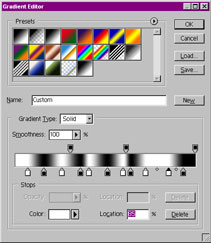
To create the swirly dividers, choose the Selection Tool, and select a narrow strip.

Fill the selected area with a dark brown. I've used #724C40 here.

Press Ctrl+D to deselect.

Click Filter > Twirl, and press OK.

Change the layer to Color Burn.

Right-click this layer, and Duplicate it.

To flip the duplicate layer, click Edit > Transform > Flip Horizontal.

If you're using Photoshop 6.0, 7.0, or CS, choose the Shape Tool to put in an extra doodad (a flower in this case.) Once you've clicked the Shape Tool, make sure the "Fill Pixels" square, at the top left of the screen, is selected. Then, click the drop-down box next to "Shape:". Click the sideways arrow, Choose "All", and press OK. Then select the Flower from the list. Hold Shift and apply it to your image.

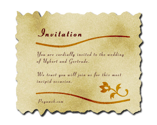
Your own printable wedding invitation is now complete.

Read More.

Bookmark and Share

Monday, July 20, 2009

Doing Your Own Company Logo Design

Having your company logo design done by a professional can be an expensive process. Hopefully this tutorial will give you some ideas on creating your company logo yourself.

If you plan to have your company logo printed on paper at any stage, I would strongly advise making it high resolution (300 dots per inch or more), otherwise your image will look pixellated when you print it. You can always create a smaller, lower-quality version of your company logo design for the web.

1 – The company name

Start by using the Text Tool and typing the main word of your company name. Select a darkish or midtone colour, and choose a serif (curly-edged) font such as Palatino Linotype or Times New Roman. Use all capitals, and slightly enlarge the first letter.

2 – Creating the company logo sub-text

Using the same font, put the rest of your company name, or some other descriptive phrase, underneath the main header. Use a much smaller font size, and increase the letter spacing by typing a high number into the "Tracking" box. (Alternatively, you can just put a space between each letter.)

The horizontal lines I've put in help to separate out and highlight the text of the company logo. An easy way to make a line is to use the text tool and type an underscore ( _ ), then press Ctrl+T to transform it into an elongated shape.


3 – Adding a graphic element to your company logo design

With just words and lines, your logo design will look dull.

If you don't already have a small image you'd like to use, you can use the Shape Tool in Adobe Photoshop 6.0 and 7 to draw a shape.

Another option is to use the Text Tool, and type a character in the Wingdings font.

At this point, your company logo design is finished, and will look good both on screen and on paper. However, if you want to embellish it further for the screen, then read on. Embellishing your company logo design will make it look nicer, but it won't be as clear.

4 – Adding a vertical border to your company logo

A black border like this will help accentuate the colours in your logo design. With your background colour set to black, click Image > Canvas Size, and increase the height of the image a bit. The extra space on your logo design will be filled with the background colour (black).

5 – Watermarking your company logo

Choose a very light grey colour, select the Text Tool, and write "jk" in Wingdings font. Make the font size very large. "j" and "k" in Wingdings show up as nice swirly characters, which make a nice watermark. In the Layers window, drag this layer almost to the bottom of the list, so it doesn't cover up any other layers.

6 – Adding some effects

To add some effects, right-click on a layer, then click "Effects" (Adobe Photoshop 5) or "Blending Options" (Adobe Photoshop 7.0 and 6). I added the following effects to some of the layers: Bevel and Emboss (set to Inner Bevel), Drop Shadow, Gradient Overlay (set to Overlay mode.)

I also changed the Comco header's text colour to blue, and made the horizontal lines orange. Feel free to change any of the colours on your company logo to whatever suits your purpose.

If you can't manage to do it yourself, you can get professional logo design done fairly cheaply at LogoWorks. Have a look at their site if you're interested.

Read More.

Bookmark and Share

Displacement efect photoshop

It's easy to make a coloured block of text, or a simple diagram (e.g. a flag), but to make it look like it's actually real, you'll need to follow these steps:


1 – Setting Up

Take your object (Australian flag in this case), and make some space around it, by clicking Image > Canvas Size, and putting in a greater height and width for the canvas.

2 – Creating a Gradient

Now make a new image, the same size as your first image.

Select the "Gradient" tool, and edit the gradient (Click on the visual representation of the gradient, or click on "Edit" on the Options tab.) Put in lots of black and white markers, as I've done in the image (this will make your gradient produce black and white bars).

3 – Applying the Gradient

Hold down Shift, and apply the gradient across your new image from left to right.

4 – Softening the Gradient

Click Filter > Blur > Gaussian Blur, and blur your image a bit. This image is now your "displacement map". Save this image (I generally use the name "dispmap.psd").

5 – Applying the Displacement Map

Now go back to your original flag image, and click Filter > Distort > Displace. Put 0% in "Horizontal Scale" and 5% in "Vertical Scale". (You can go higher if you want the waves to be bigger.) When it asks for a file, select your displacement map. (This will distort your image depending on how dark the displacement map is at that point.)

6 – Bringing in the Displacement Map

Now grab your displacement map image, and drag it onto your image. Use the arrow keys to nudge the displacement map until it covers the whole image.

7 – Using an Overlay to Create Some Light

Change the displacement map layer's Mode from Normal to Overlay, and reduce its opacity (75% is good).

Voila, a funky flag. Scroll up and compare this image to the first one, and you'll really notice the difference.

This technique can also be used to make realistic curtains, ribbons, and banners.

brus tool dragonbrunes you like download clik hare


Read More.

Bookmark and Share
Related Posts Plugin for WordPress, Blogger...
saifuddin
aceh
BANDA ACEH
NANGGROE ACEH DARUSALAM
aceh, male, 23000
nanggroe aceh darusalam
Work: 06517555275
Fax: 06517555275
uddin_bireun@yahoo.com
Visit MyBlogLog and get a signature like this!
Add to Google Reader or Homepage Internet Marketing & SEO (Affiliates) - TOP.ORG Google bot last visit powered by [0051] Software Top Blogs powered by [0051] Yahoo bot last visit powered by  [0051]

SOFTWARE DOWNLOAD AND TUTORIAL PHOTOSHOP CORELDRAW ©Template Blogger Green by Dicas Blogger. SOFTWARE DOWNLOAD AND TUTORIAL PHOTOSHOP CORELDRAW ©Template Editing by Udin Sira.

TOP